top of page

SHAPING SPACE FOR LIFE
CLIENT
ATTHAYASAI ASSET
TYPE OF CLIENT
REAL ESTATE DEVELOPER
CATEGORY
CORPORATE POSITIONING, BRAND EXPRESSION, STORYTELLING
BRIEF
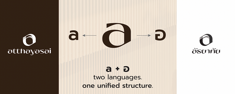
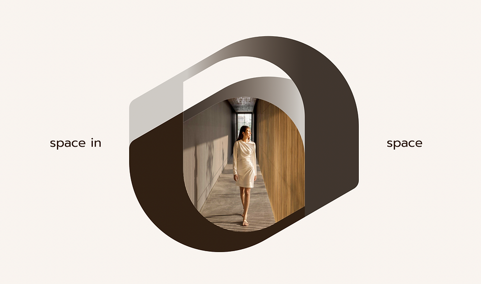
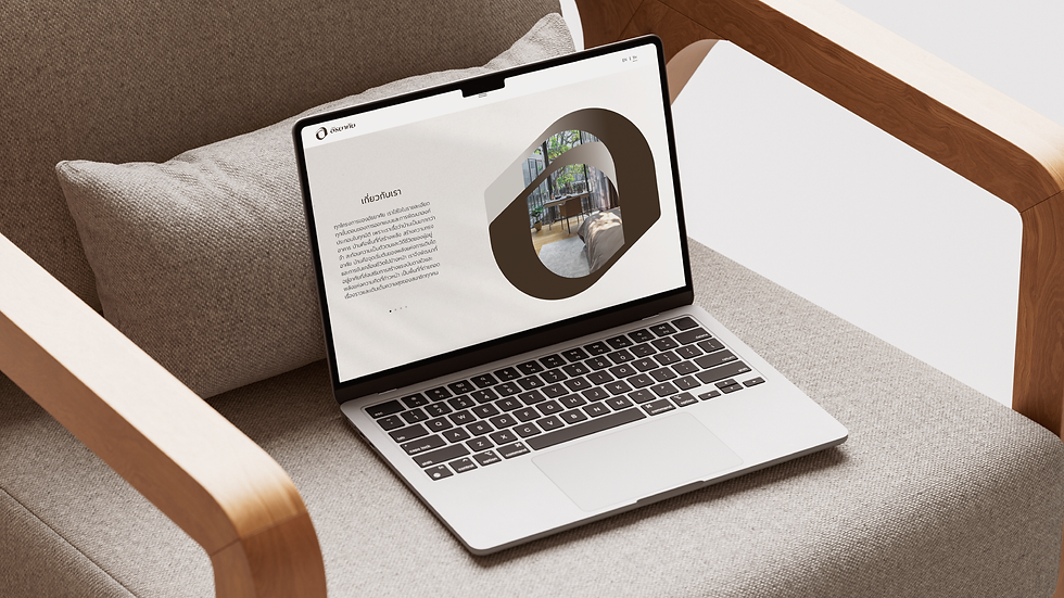
Developed for a new real estate developer brand, Atthayasai was built on the philosophy that spaces shape life. Rooted in nature, warmth, and human connection, the identity merges the letter "A" and Thai character "อ" into a fluid symbol representing harmony between local heritage and contemporary living. The project encompassed brand strategy, identity design, website development, and social communications to create a cohesive and meaningful brand experience.





READY TO BUILD SOMETHING TOGETHER?
bottom of page